Bay FC
Brand Identity & Logo Design
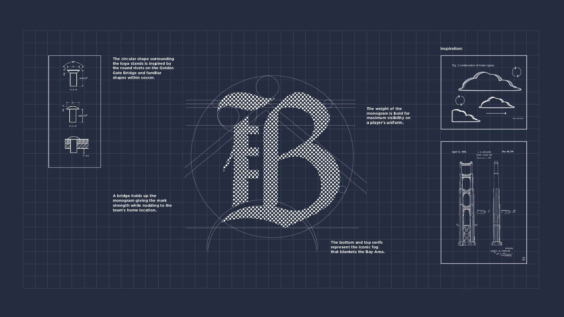
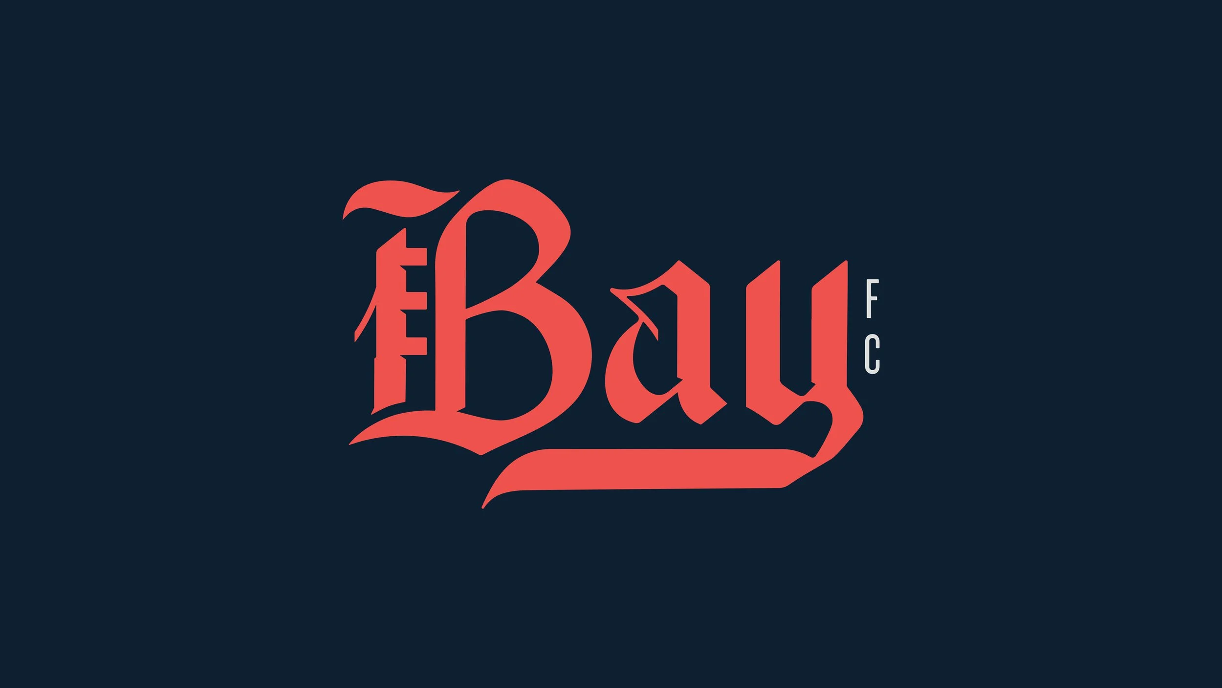
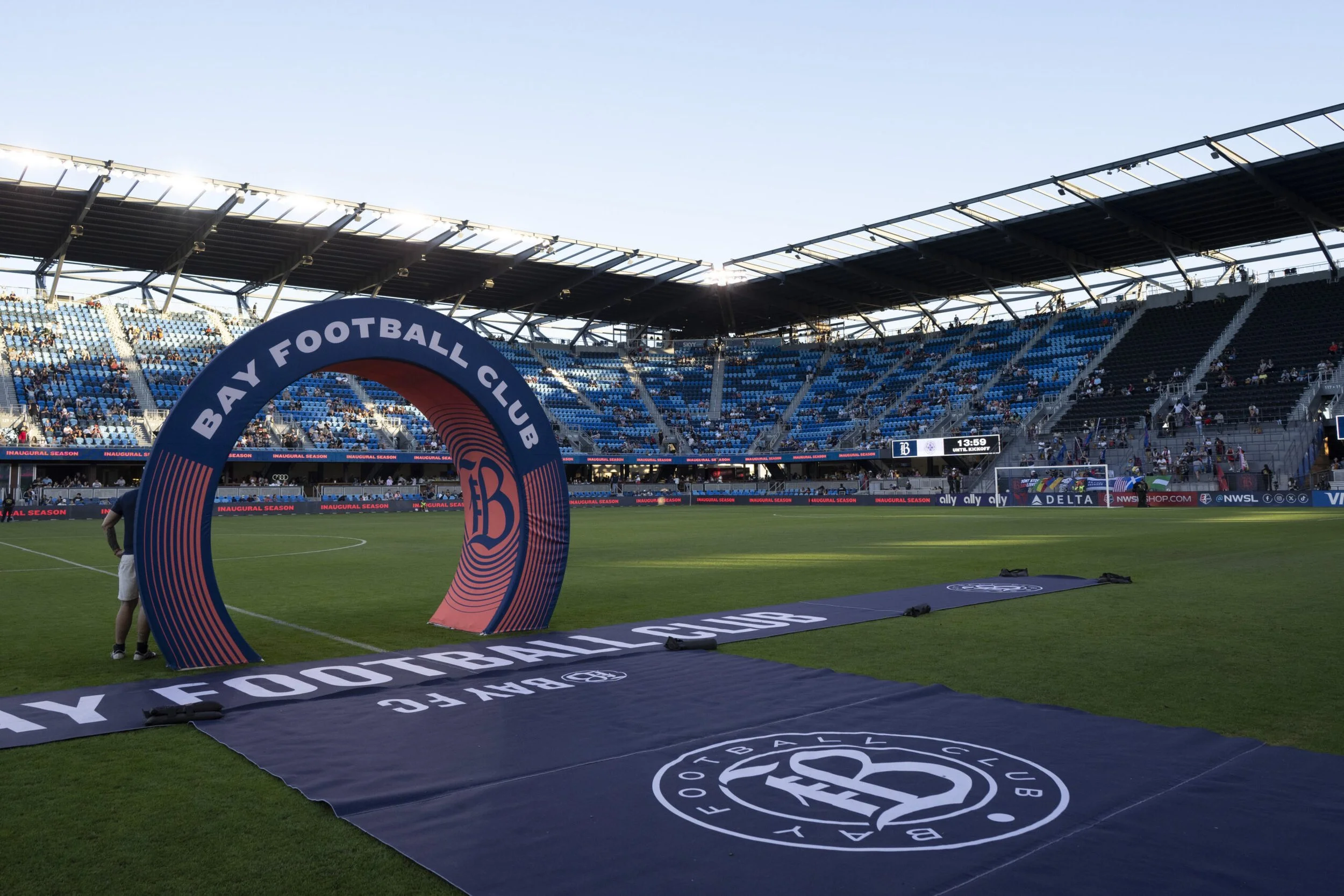
For the NWSL’s 14th team, the challenge was to create a name and visual identity that could represent the full spirit of the Bay Area. I designed an iconic “B” mark that blends the structural form of the Golden Gate Bridge with classic gothic typography, honoring both the region’s architecture and its creative edge. The exaggerated serifs evoke the sweep of coastal fog, while the overall shape balances strength and style. Built to live beyond the field, the logo is designed for fans to wear, share, and make their own.


In the Hands of the Fans
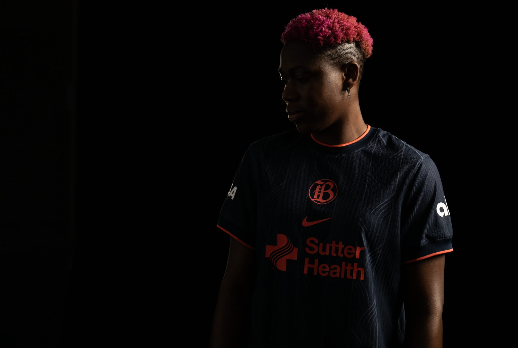
The real reward is seeing fans bring the design to life. From scarves and jerseys to handmade signs and chants, the logo has become woven into the rhythm of game day. That’s when identity becomes culture.

All design and direction by Benny Gold, unless additional credits are listedPhotography: Emillio Diaz • Motion Design: Natasha Candelaria • Naming: Caroline Cappelli • Video: Partners In Crime • Drone Video: Studio96