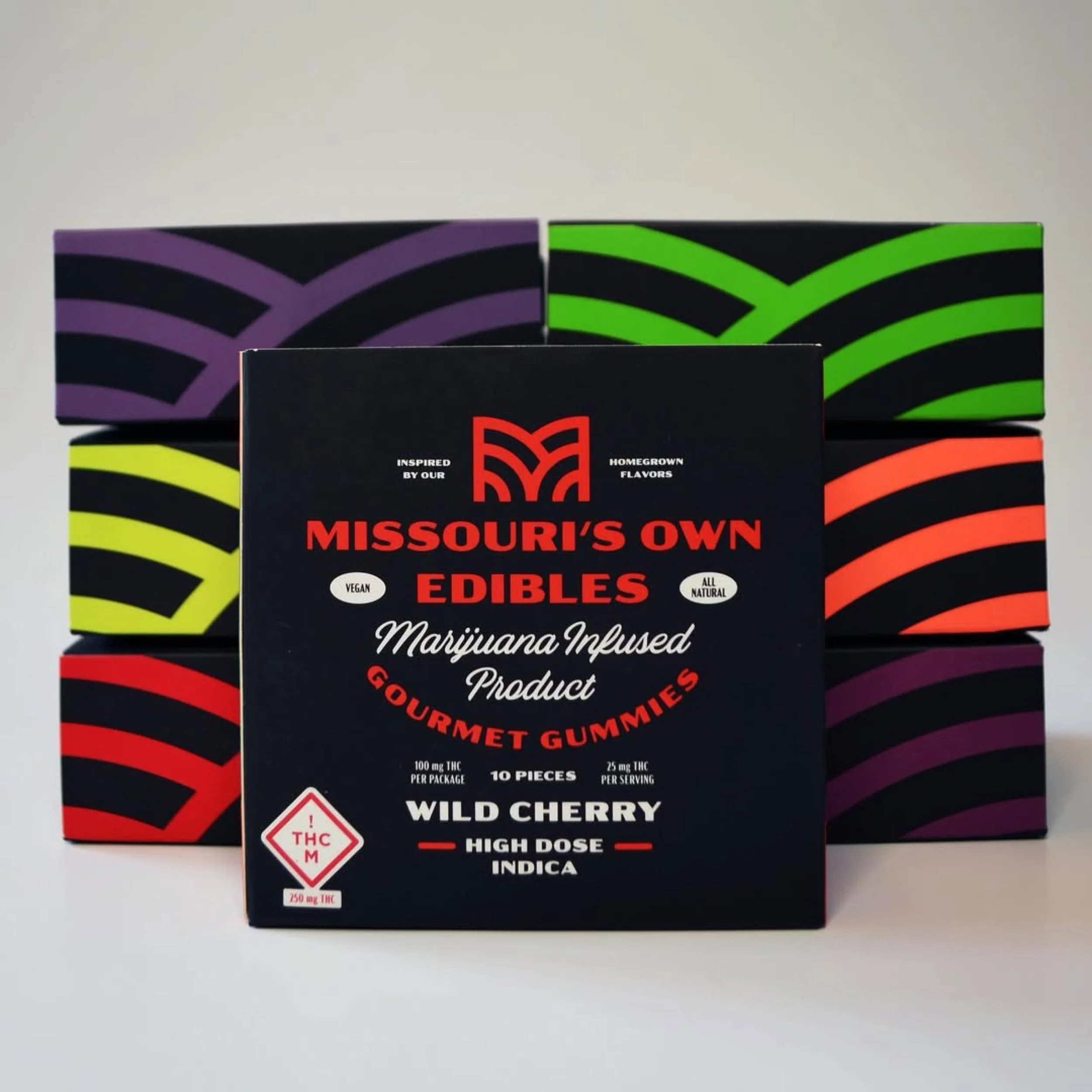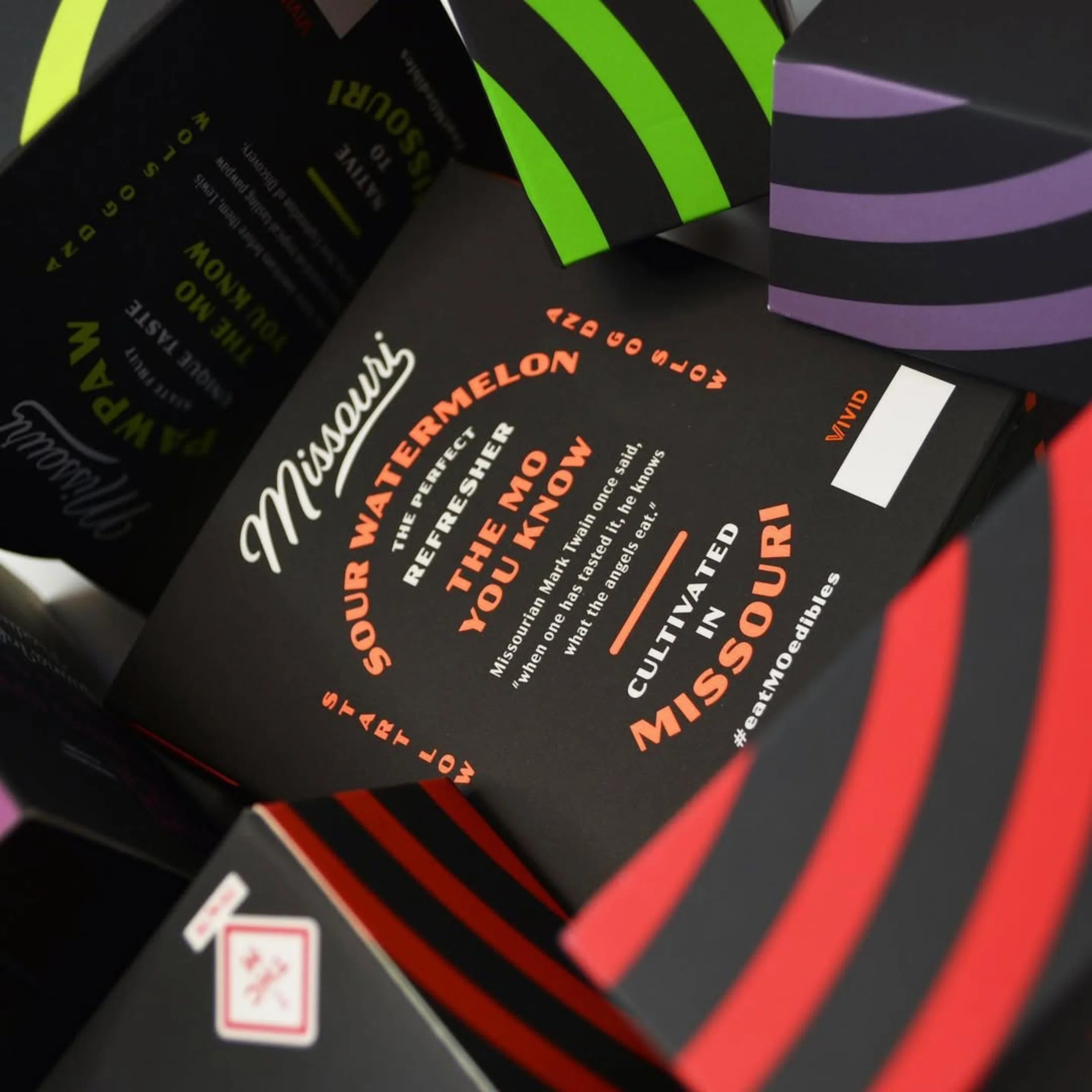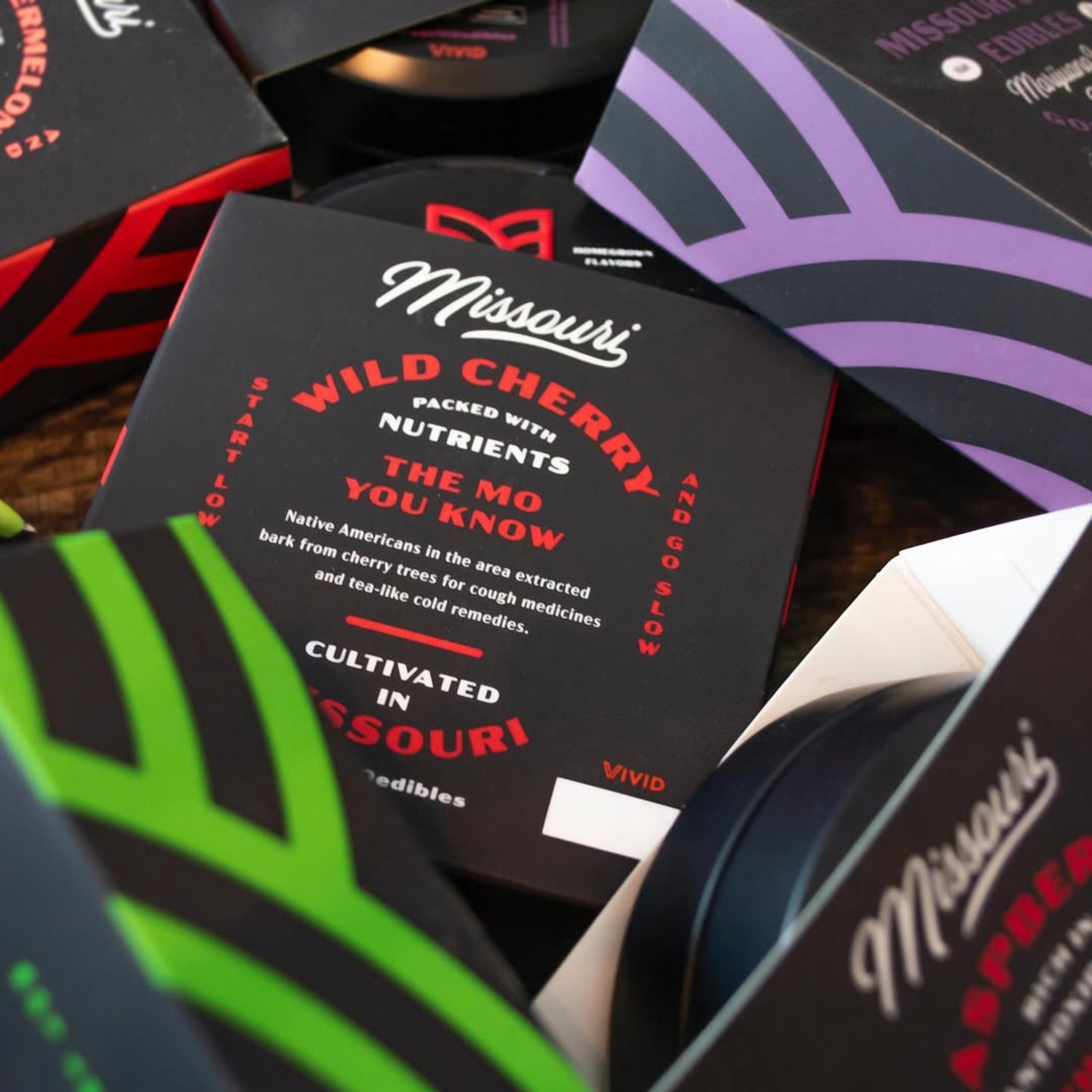

Missouri’s Own
Logo & Packaging Design
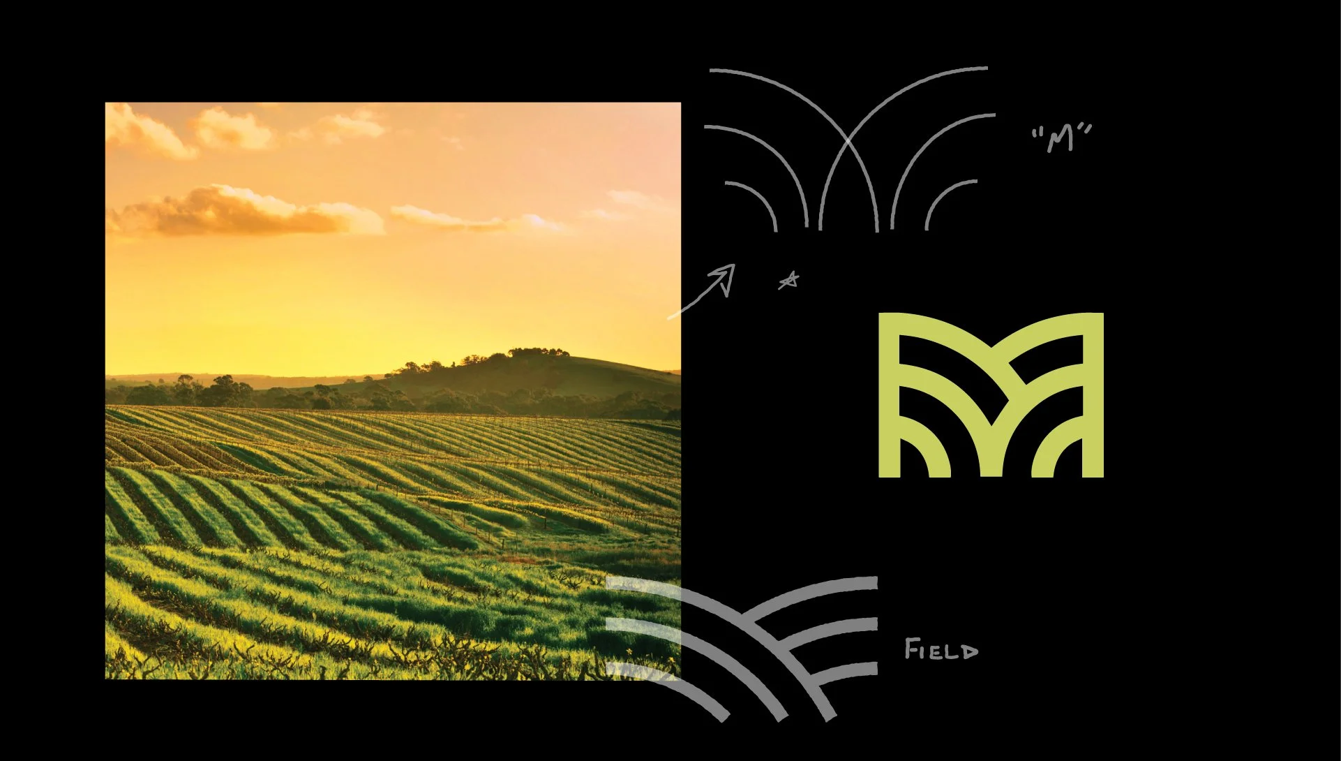
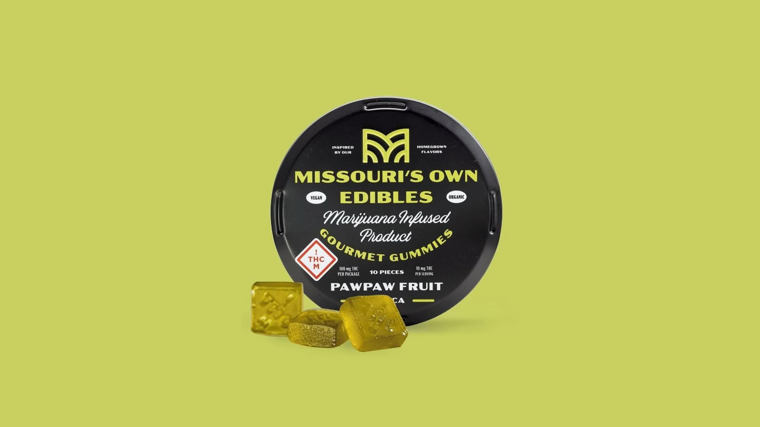
The “M” mark draws from Missouri’s rich botanical landscape, grounding the brand in both nature and place. Designed to feel honest, elevated, and adaptable, the identity extends seamlessly across packaging, helping position Missouri’s Own as a trusted, locally rooted edibles brand.


Photography: Vivid • Copy: Anthony SimmonsAll design and direction by Benny Gold, unless additional credits are listed